In our Email Editor the structure of your responsive email campaigns is assembled using Components, the building blocks of your email. The benefits of using components to build your campaign is that you have much greater flexibility when designing your layout, with the ability to add, remove and reorder single and multi-column components to suit your needs.
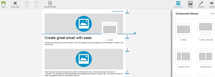
To add a component to your campaign, simply click on the Components icon in the top-right of the editor and drag a component from the panel into your campaign. To ensure the component drops where you would like it to, look out for the blue horizontal guide line which indicates where the component will be inserted.

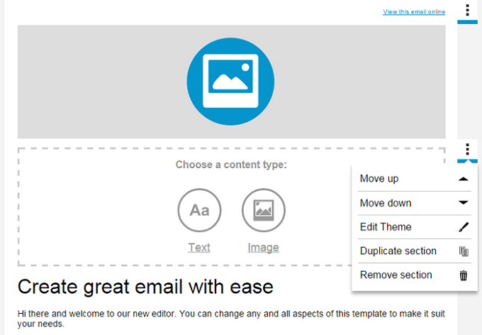
Once a component is added to a campaign we call it a section, because it can be expanded by adding further articles within it. The top of each section is indicated by tabs displayed on the right-hand side of the campaign. Clicking on these tabs accesses drop down options to move a section up or down, duplicate it, remove it or edit the section theme.

You can add articles to your section by hovering over an article and clicking the plus symbol that appears below. The new article will be added beneath. This is useful if you want, for example, a row of two images with text directly beneath each image. When the responsive campaign is reviewed on a mobile they would stack vertically as image, text, image, text, rather than two images followed by two paragraphs of text as they would if you inserted the text in its own new component.

Articles can be moved by hovering over the article, holding your cursor over the arrow cross in the bottom-left corner and dragging and dropping into position. Or you can click on the up and down arrows next to that to move the article up or down a step at a time. The recycling bin icon let's you delete an article.