Nowadays people view emails in all sorts of places, using a whole host of devices, operating systems, browsers and email clients. For example, there's every chance that a subscriber could receive your email on their PC at work, take another look on their smartphone on the journey home, then switch to a tablet for a better read later in the evening. Responsive email design ensures that they'll get a top-notch experience with your email regardless of viewing context.
What is responsive email design?
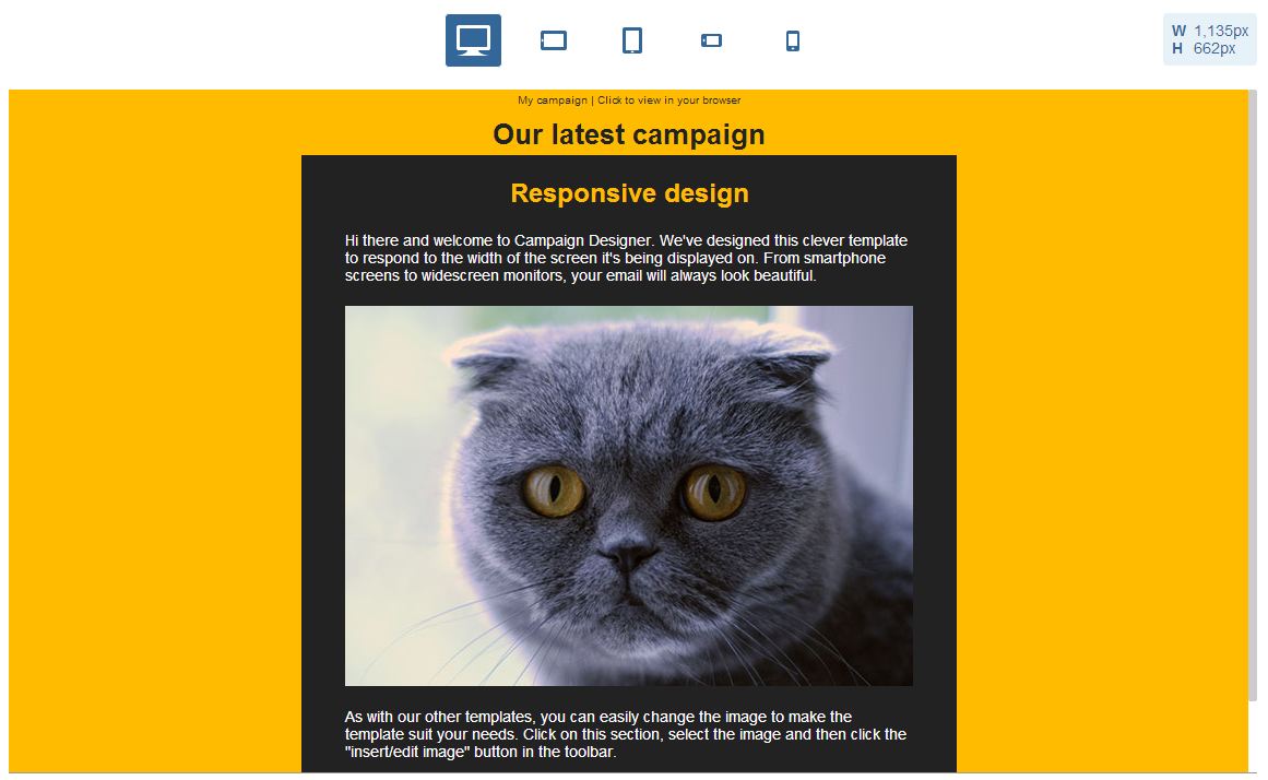
It's a way of coding emails that allows them to fold down beautifully when viewed on smaller screens. It essentially allows a design to be versatile enough to play nice on all devices. For example, your email might look like this on a PC:
Then like this on a smartphone:
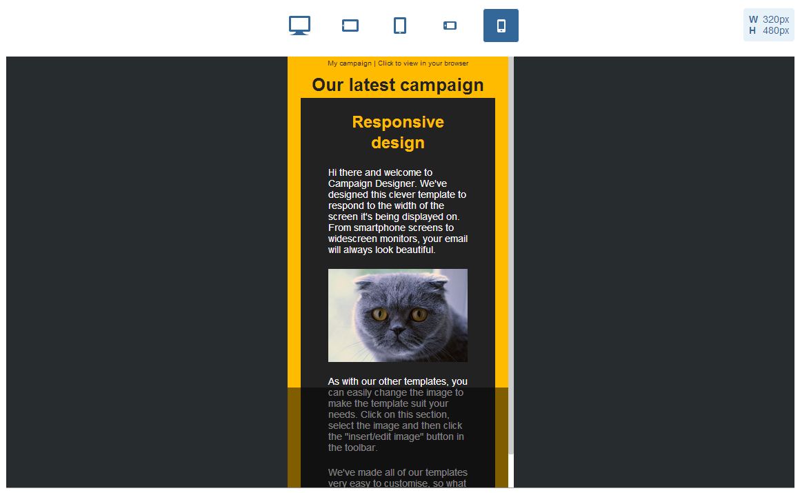
Note how the image resizes appropriately, and the text re-wraps to accommodate the narrower screen without becoming smaller. The overall design remains ultra-accessible to the reader and avoids them having to zoom or horizontally scroll to get the full message.