This guide is for our Email Editor only and is aimed at those with a working understanding of HTML for email and XML.
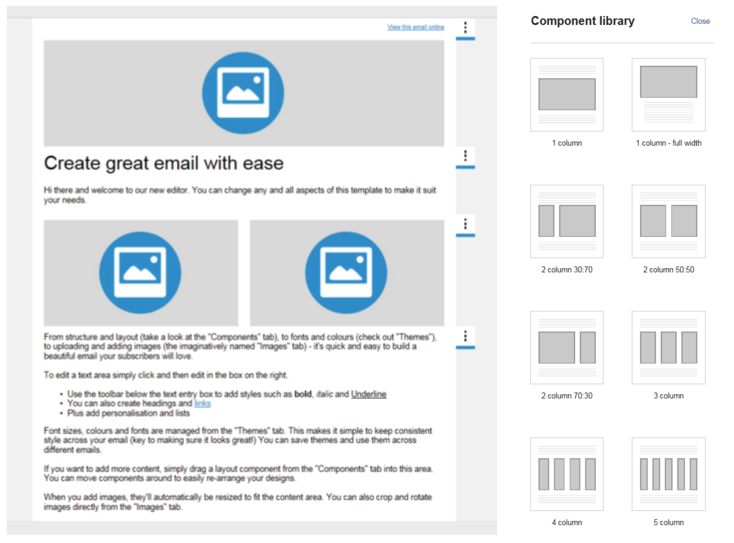
In our Email Editor the structure of your responsive email campaigns is assembled using Components, the building blocks of your email. This allows flexibility when designing your layout, with the ability to easily add, remove and reorder single and multi-column components to suit your needs.
There are a number of components available in the Component library within the editor, but you can also create your own custom components. Please read our guide to creating Email Editor templates and custom components as a starting point.
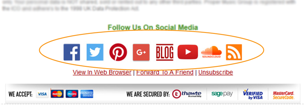
In this guide we'll walk through an example custom component for use as a social media footer.
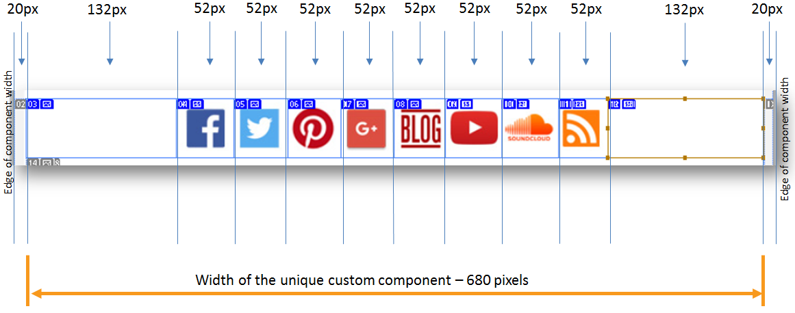
All components have a standard width of 720 pixels and most have spacers to the right and left of 20px each, thus leaving you with a workable area of 680 pixels.
First, make sure you have your images saved in the correct sizes for use in your component and preferably saved as .png with transparent backgrounds. This will allow you to change the background colour of the component in the editor using Themes if needed.
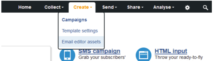
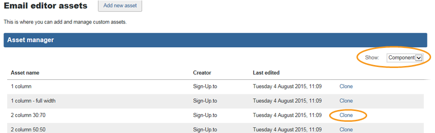
With the images saved, select 'Email editor assets' under the Create tab.
Ensure that the drop down is showing 'Components', then clone an existing component.
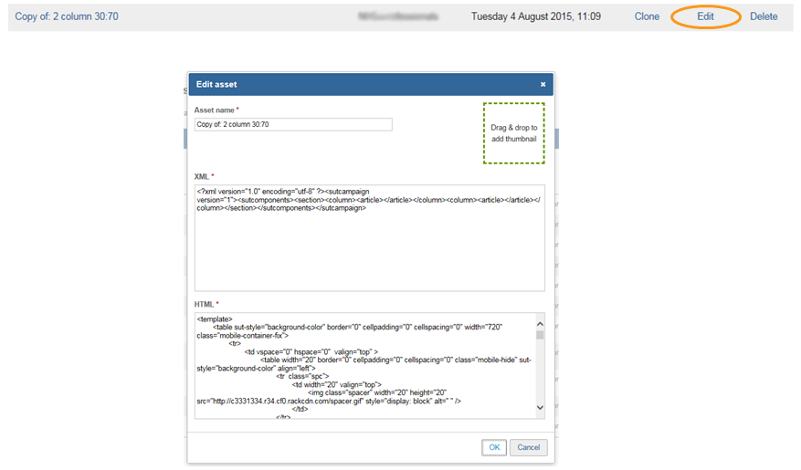
In the new cloned component, click Edit. This then brings up the Edit asset window.
Next amend your HTML code to reflect the correct number of ‘columncontent’ tables required, and set their widths to match your image widths accordingly. No images or content should be added at this stage; the component you are creating is merely the layout for the social media footer.
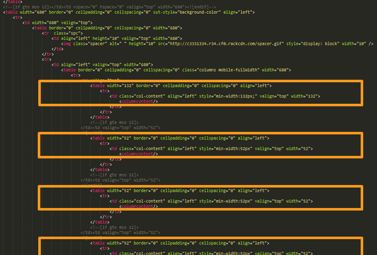
You may want to add the class="mobile-hide" command to hide areas of the component when viewed on a mobile device. This would need to be added to each individual table that you wish to be hidden.
In the cloned Edit asset window, update the HTML code in the HTML area and rename the asset appropriately (this will be the name displayed in the Email Editor).
As this is a multi-column component, the XML will need <column><article></article></
<?xml version="1.0" encoding="utf-8"?>
<sutcampaign version="1">
   <sutcomponents>
      <section>
         <column><article></article></column>
         <column><article></article></column>
         <column><article></article></column>
         <column><article></article></column>
         <column><article></article></column>
         <column><article></article></column>
         <column><article></article></column>
         <column><article></article></column>
         <column><article></article></column>
         <column><article></article></column>
      </section>
   </sutcomponents>
</sutcampaign>
Then press OK to save. Your custom component has now been added to your account.
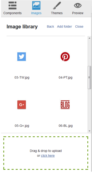
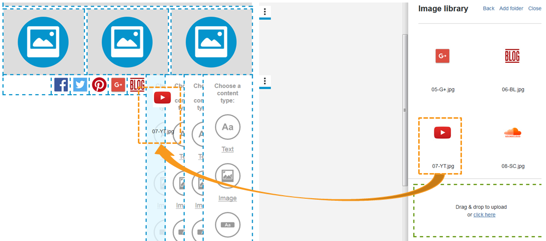
To use this component as a social media footer, you would then open the Email Editor and upload your social icons to your Image library to host your images.
Next drag your new custom component into your campaign from the Components library.
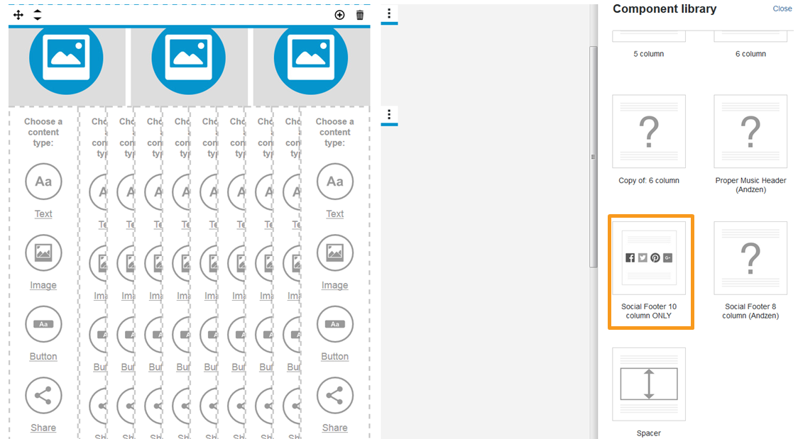
Then drag an drop your social icons into the component.
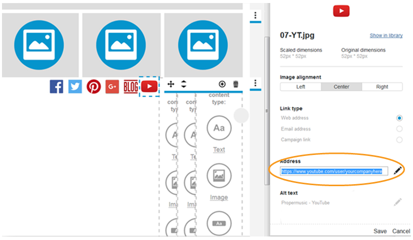
To add web links to the icons, click on the icon within the component and insert the URL in the panel on the right and click Save.
You can then use our Save as component feature via the section tab to save your content filled version of your custom component to the Component library.