Clear 'calls to action' play a significant role in ensuring that your email campaigns effectively prompt your subscribers where you'd like them to go next, be that downloading a voucher or whitepaper, completing a data capture form or simply driving them to a website. We've now made this is a lot easier for you to achieve with the addition of our 'Button' feature.
How to place a call to action button in your campaign
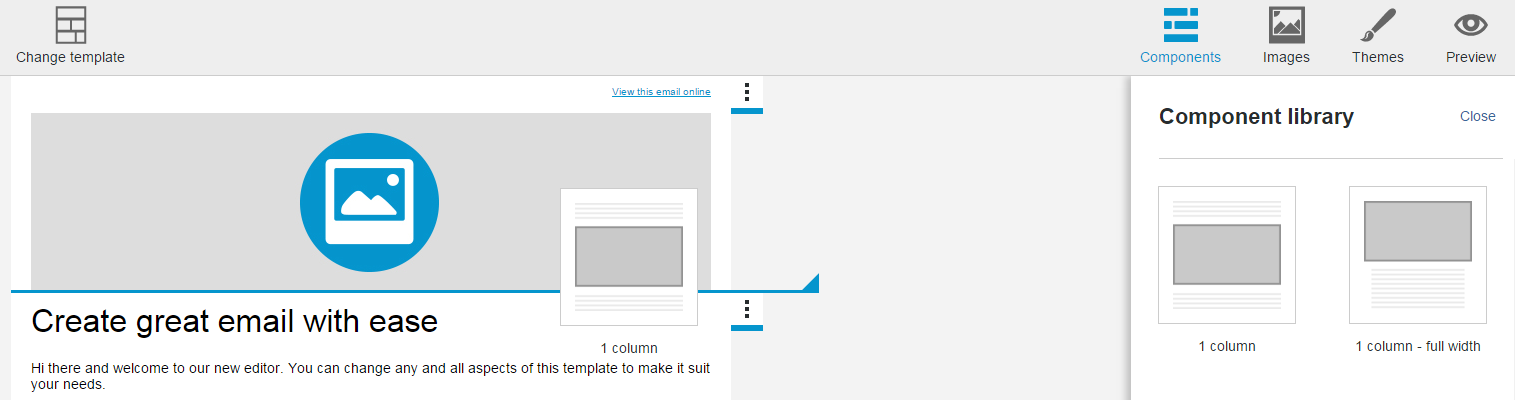
First, click on the 'Components' icon in the top-right of the editor and drag a component from the panel into your campaign. To ensure the component drops where you would like it to, look out for the blue horizontal guide line which indicates where the component will be inserted.
If you're using components with multiple columns and you'd like your button to stack appropriately when viewed on a mobile device, with it's associated images or text above or below, then you can add articles to columns within a section by hovering over an article and clicking the plus symbol that appears below.
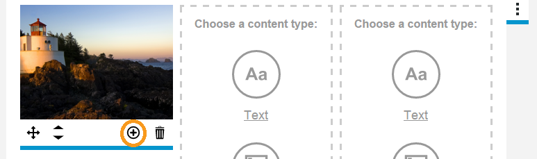
The new article will be added beneath.
Creating and inserting your button
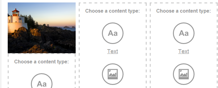
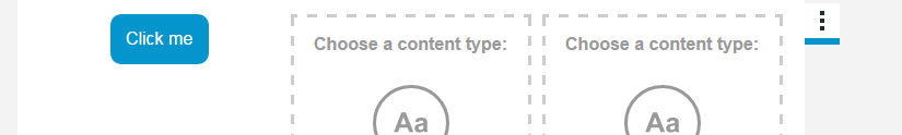
Next step is to select your content type. Click on the new article that you'd like to insert the button into and select 'Button'.
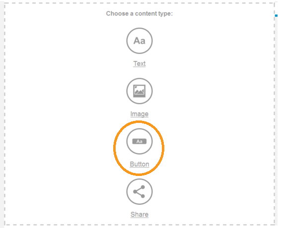
This will insert our default button.
To edit the button, click on it and the 'Button' properties panel will open on the right.
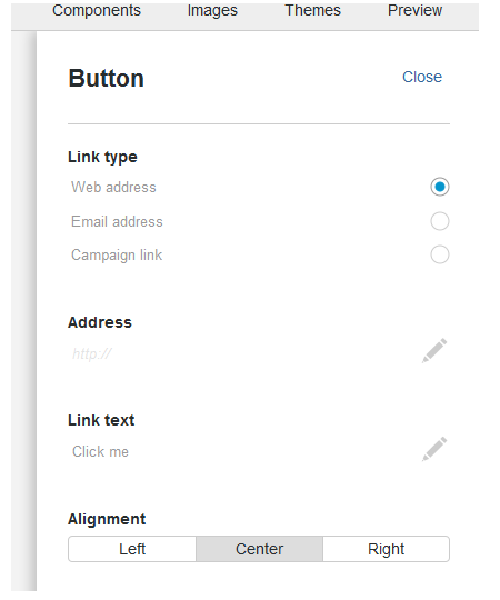
Here you can specify the type of link that you'd like to sit behind the button, be it a web address, email address or campaign link.
Web address: Specifying the web address link type will allow you to insert a web address (URL) below. You can also add link personalisation here.
Email address: This link type gives the ability for people to send you an email. When you click on the 'Email address' link type it will allow you to enter a contact email address below.
Campaign link: This allows for further campaign personalisation, such as an option for recipients to unsubscribe or send your email to their friends. There are also options for links to the web version or plain text version of your campaign.
You can set the instructive text that will appear within the button using the 'Link text' field.
The 'Alignment' property gives you the option to Left, Center or Right align your button within the article area.
Styling your button
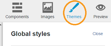
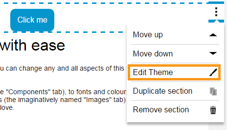
All button styling is handled in Themes. Using the 'Themes' tab applies global styling across all buttons in the campaign. Button styling can be found by scrolling down to the bottom of the theme panel. You can even apply a unique theme to a section using the section tab menu and 'Edit theme'.
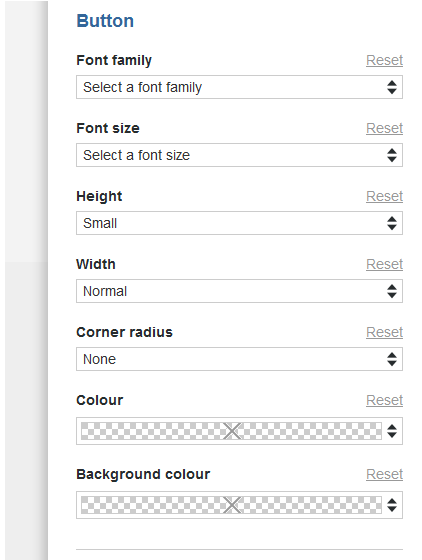
When styling your button you can specify the font family, font size, height (the area above and below the button text), width, corner radius (how rounded the corners are), colour (text colour) and background colour (button colour).
Buttons are fully responsive, and will even degrade gracefully on less capable email clients like Outlook. Outlook doesn't respect rounded corners, so if you'd really like rounded corners to appear on your button for subscribers viewing in Outlook, you will need to create an image of your button, upload it to your image library, drag it into the campaign and then link it.