It is possible to create your own templates and custom components for the Email Editor in Sign-Up.to.
- Understanding the structure
- Creating a custom template
- Managing your custom templates
- Save as component
- Creating custom components
- Transferring templates with custom components
Email Editor campaigns have a unique structure to allow them to be highly flexible, separate content and layout and be fully responsive (adjust their layout for display on different devices). Understanding this structure is key to successfully creating your own templates.
Understanding the structure
A template consists of four distinct elements:
1 - Boilerplate
This is the core structure of an email in our editor, and isn't editable. It's simply a series of basic CSS declarations which set up responsive behaviour and define the width of the email canvas (720px). You don't need to worry about the boilerplate when creating your template, it's always generated for you.
2 - Components
These are the building blocks of your email layout - components are stacked on top of one another within the email canvas and always span the full width. A single component can contain multiple editable content areas. Components can be used for generic layouts - like the default components included with the editor, or can be highly customised and contain predefined content and non-editable regions.
3 - Content
Editable areas within a component can contain one or more pieces of content. The editor currently supports four kinds of content: text, images, buttons and social sharing icons. You can predefine content that appears within a component, or leave sections empty for users to select.
4 - Themes
Themes define the styling of content elements - fonts, sizes, colours, spacing etc. Each email has a global theme that applies to all content by default. Individual components can have a custom theme applied to them which overrides the global theme just for that component.
In summary, an email template is composed of a series of layout components stacked on top of each other to define the structure. Into these components you insert your content, and then apply a theme to give a consistent look to the content.
Creating a custom template
To create your own template, first build your design using the components and tools in Email Editor. You can start from any pre-existing template.
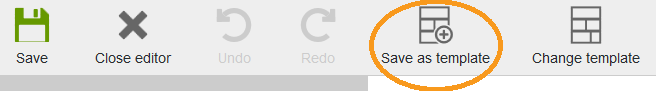
When you are confident that you have your desired design simply use the 'Save as template' option.
Note: If you are a sub user and do not have access to the 'Save as template' option, please contact your account admin user who has the ability to enable it for you by editing your sub user permissions via their account cog. They'll need to select Settings, Edit user then tick 'Email editor assets'.
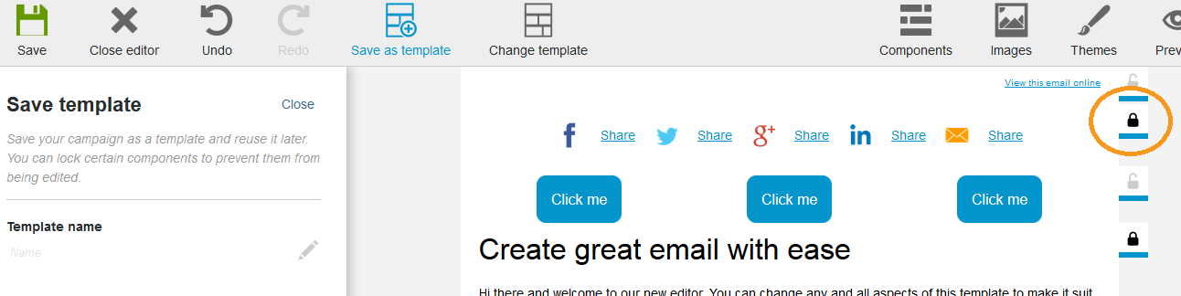
Once, you've clicked 'Save as template', if there are any sections in your templates that you wish to be uneditable when the template is used to create campaigns, you can lock the section. Locked sections cannot be duplicated.
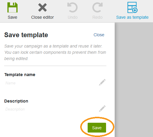
Give your template a name and description, click Save and your creation will be made into a template.
Once saved as a template, it will appear in the template browser when the Email Editor is opened.
Please note: each time you save a template, a new generation of the template is created. This is so that you don't accidentally overwrite any previous template creations. For different versions of your template we recommend adding something like "version 2" or "v3" etc. in series, so that you don't end up with multiple templates with identical names. Alternatively, when building your template, save the design as a campaign until you're ready to save it as your final template.
If you wish to unlock a locked section in your saved template, you can do so by opening the template in the editor, clicking 'Save as template', unlocking the section and saving it as a new renamed template. Alternatively you can amend the code via 'Email Editor assets' under the Create tab. Set the drop down to 'Templates' and edit the XML for the template. Look for any instances of locked="true" and replace with locked=”false”.
You may want to create a layout which requires custom components and additional coding. To do this you'll need to build your own components which you can add to your design.
Managing your custom templates
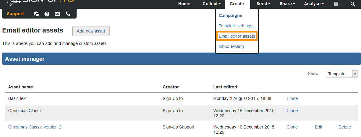
If you wish to delete any of your custom templates, you can do so by going to 'Email editor assets'. The name, description and XML can be directly edited here or the template cloned or deleted.
Save as component
You can now use the editor to save content filled components, to use again in future campaigns.
Please note: This feature is only for applying content using the editor. If you would like to adjust the layout or structure of a component you will need to create a custom component using HTML and XML code via 'Email Editor Assets'. If you are a sub user and do not have the 'Save as component' option available, please contact your account admin user who has the ability to enable it for you if they wish by editing your sub user permissions via their account cog. They'll need to select 'Settings', 'Edit user' then tick 'Email editor assets'. If you don't have access to 'Save as component' you will still be able to use the custom components created by other users.
1. First, drag a component from the Component library into your campaign and populate it with your content.
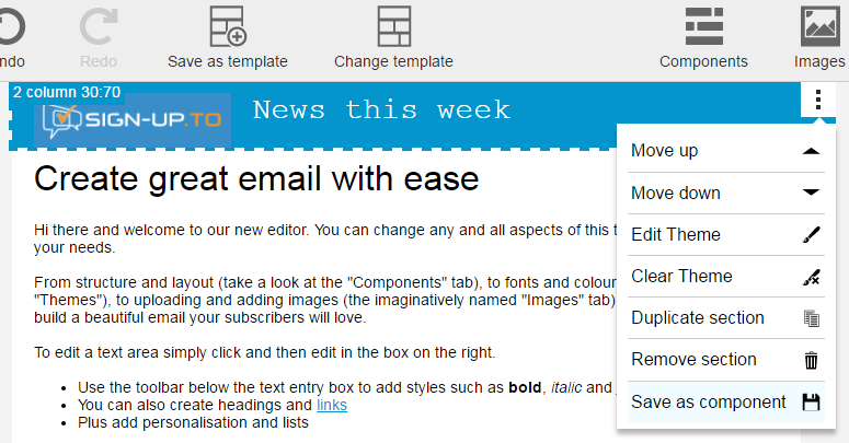
If you would like to fix the theme for your component, click on the section tab (3 dots on the right-hand side of the component) and select Edit theme. The theme can then be edited in the panel on the right.
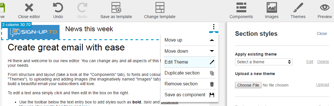
2. Once you're happy with your content, click on the section tab and 'Save as component'.
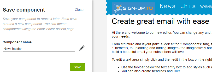
3. Name your component and then save.
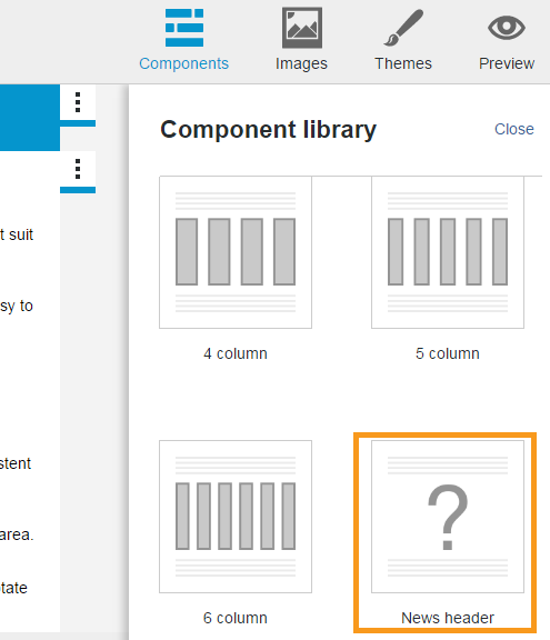
Your component will now appear in your Component library. Each save creates a new generation of component, so that you don't accidentally overwrite any previous component creations. For different versions of your template we recommend adding something like "version 2" or "v3" etc. in series, to prevent multiple components with identical names.
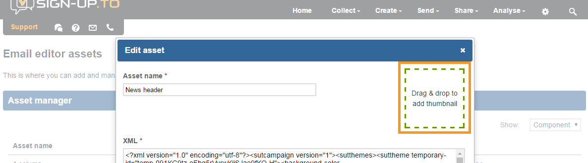
To manage your components, exit the editor, select 'Email Editor Assets' from the Create tab and use the Asset manager drop down to display 'Components'. You can add a thumbnail image for your component (to display in the Component library) via 'Edit', then drag and drop an image of your choice. We recommend an image size of around 150 pixels square as a guideline.
Creating custom components
By creating your own custom components it's possible to achieve a huge range of design effects.
A component has two elements - HTML which defines the layout and XML which defines the content. In order to create custom components you will need a working understanding of HTML and XML.
The simplest way to get started on creating a component is to copy one of the default components in an account and edit that. Go to the 'Email Editor Assets' section in Create, select Components from the drop down on the right and click 'Clone' next to the component you want to use as a starting point. This will create a new editable component based on that code.
The HTML:
This is used for defining the layout structure, using tables. The entire component should be wrapped in its own containing table and template tags.
Note that any content or styling you include directly in the HTML won't be editable by the user. To create an area where you want to have user editable content use the <columncontent/> tag.
Background colours: by adding sut-style="background-color" to a table or cell you allow the colour to be set using themes. If you hardcode styles they won't be user editable.
Hide on mobile: if you add class="mobile-hide" to an element it will be hidden when viewed on a mobile device.
The XML:
XML is used to define the content regions in your component. You must declare each editable region, and you can then either leave these blank so that a user can simply add their own content or define some default content that will appear.
Below is an example XML for a component with a single blank editable region in the HTML.
<?xml version="1.0" encoding="utf-8"?>
<sutcampaign version="1">
   <sutcomponents>
      <section>
         <column>
            <article></article>
         </column>
      </section>
   </sutcomponents>
</sutcampaign>
If we instead wanted to have a default blank image showing in the component, we'd do this:
<?xml version="1.0" encoding="utf-8"?>
<sutcampaign version="1">
   <sutcomponents>
      <section>
         <column>
            <article>
               <image></image>
            </article>
         </column>
      </section>
   </sutcomponents>
</sutcampaign>
You can also stack content elements within an area - so we could have text below the image:
<?xml version="1.0" encoding="utf-8"?>
<sutcampaign version="1">
   <sutcomponents>
      <section>
         <column>
            <article>
               <image></image>
               <text></text>
            </article>
         </column>
      </section>
   </sutcomponents>
</sutcampaign>
Saving a custom component:
To save your custom component you'll need to add the XML and HTML into your cloned component within the 'Email Editor Assets' section.
You can optionally add your own custom thumbnail which will appear in the component panel within the editor. This should be a 200 x 200 px .png.
Testing:
Once you have added a custom component it's very important to test it in the editor. Incorrect HTML or XML could crash the editor, so if you experience any issues, check your component for errors and retest.
Transferring templates with custom components
If you have access to multiple Sign-Up.to accounts and wish to transfer a template across to another account, you can do so by copying the XML code of your custom template from Email editor assets and adding the template asset to Email editor assets in another account. For templates with custom components, you will need to also copy across the custom component too. If not, the editor will break when a user attempts to create a campaign from the custom template.